It’s easy to get excited about expanding your brand’s online presence from blogs to websites to social media channels. Unless you’re going for some un-branded (or less branded experiences) it’s helpful to have some consistency across channels for look and feel.
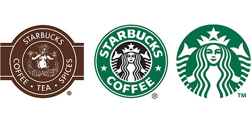
First, consider your logo.
It’s your logo for a reason – it’s meant for people to recognize your brand without having to say your full name all the time.
Look at Nike and the iconic swoosh. They don’t have to put Nike all over their social channels, websites, and ads for you to know who it is. I caveat that this takes time for people to make this correlation and Nike has been doing this for quite a while.
Tip: Keep your logo consistent and use it across your social media channels and web presences (profile image, favicon, background images, etc) and email exchanges with your customer audience.
Second, ensure that the color theme of your brand is consistent.
For example, if your colors are blue and white, ensure your website, email messaging, and social channel backgrounds also have those colors. The more often you use them, the more often the logo and coloring are associated with one another – and your brand.
Tip: Look at American Express and their presence from the Open Forum blog to their Facebook presence. It’s all the same and easy to recognize.
Third, choose whether or not your look is clean and simple or vibrant and “out there.”
In my opinion, it’s easier to do simple and clean. However, some brands may go for something over-the-top to be seen out of the clutter of other brands in their category.
Tip: Whatever your choice, be consistent across channels.
To Read how I manage this for my own brand, check out my full post on Social Media Club.
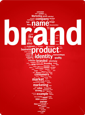
Photo source: The Inspiration Room via TIME